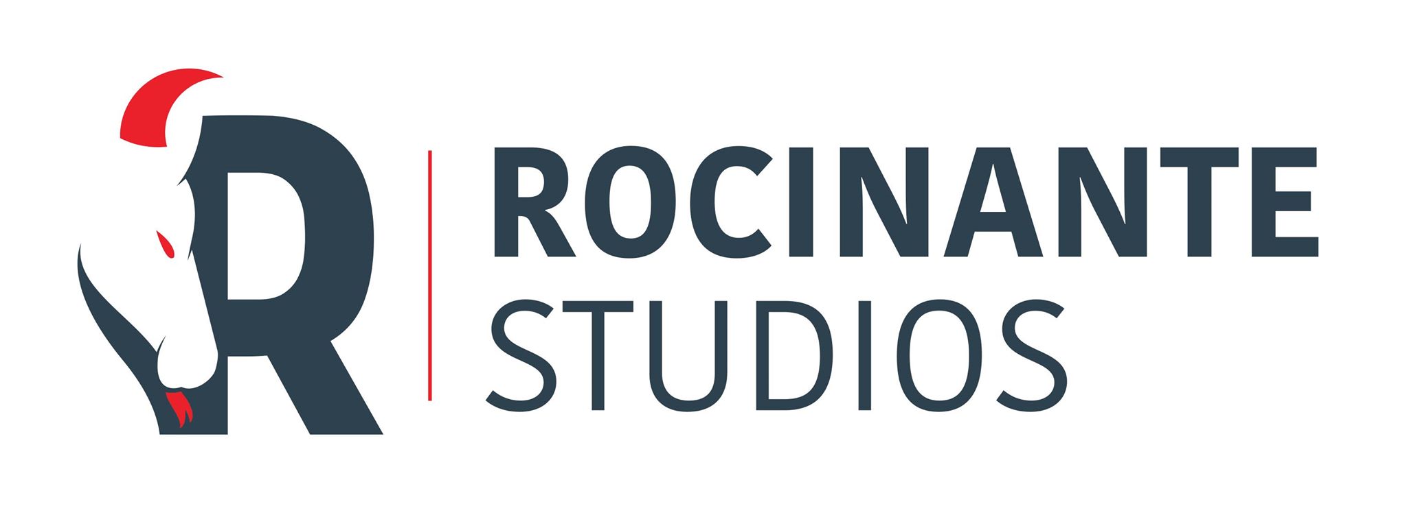
Where the Rocinante Studios Logo Came From
I had an image in my head of a horse with horns and a forked tongue, looking like it had just come up from the depths of hell. I didn't want it looking too evil though. Initially I thought there might be an image from the Robert Burns poem 'Tam o' Shanter' to provide inspiration, for a creepy looking horse. There were horses, but nothing creepy looking.
Next I started sketching out an idea of a horse looking a little angry. Not sure what I used for reference here, but this was the direction I was going in.
At this point, I needed to reference an actual horse to make the sketch look better. Fortunately, my wife Suz and I are avid horse riders who go to a great ranch called Hunewill a couple of times a year. Suz takes a lot of photos of the horses, and she took a great one of Tulena who is the horse that she used to ride. Tulena has a weird habit of letting her tongue hang out of her mouth, which you can see below, which was useful when thinking of the forked tongue idea. Tulena is probably about 18 now, which means she gets to retire from the advanced group rides with mainly adults, to the buckaroo rides with much lighter kids. The horse who I ride 'Suede' is actually grumpier and in theory a better candidate, but this photo worked really well as a reference.
I made an initial sketch from this photo, as I liked the angle of the horse's head. I made the eyes mildly 'stern' looking, and hopefully not too angry.
I tried a different horse and added bigger eyes, but preferred the original, as this one looks a little cutesy.
Next were the horns. The main issue here was that I wanted a horse with horns, not a unicorn. So I initially went with small ridged horns pointing backwards. Which probably don't have a lot of use from an evolutionary perspective, but looked cool.
At this point, my friend Lallo (who is an ACTUAL graphic designer), helped turn this into a logo. A couple of early iterations were these two:
The final one was was this, which is the logo that is now used. The horns are a little more curved and forward pointing than the original, but it fits well, especially with the curve of the 'R'.
For the sketches, I used a Wacom Intuous Creative Stylus - Wacom Intuos Creative Stylus for iPad 3/4 and iPad mini (CS500PK0), with the Sketchbook App on my iPad. I'm not so used to sketching digitally, and there's a slight delay when the point of the stylus touches the screen. Once it has touched it's fine, but if you're used to regularly lifting a pencil up from the paper, then it can be a bit weird at first. It did the job though and was relatively quick to get used to.


